Make It Responsive
Important Premises
Media queries are a powerful tool to make websites responsive. Media queries, however, are powerful when used appropriately. When designing for responsiveness, we do so to improve user experience. There are a number of things that can break the balance of good design when building with responsiveness in mind. Implementing media queries is one of them but not the only one, of course. Adaptive images, font files, and as we just said, media queries are the highest in the list to add weight to web pages (Hogan, 2014). This data weight is usually referred to as overhead. Good knowledge of these tools translates into an efficient implementation, thus maximizing user experience. This can easily represent one of the biggest hurdles developers will encounter when designing for best performance.
That Fine Line
There is a fine line, a snapping point, where excessive use of media queries, fonts, images, and more can add a substantial amount of data to web pages because of additional data requests, thus deteriorating overall user experience. A definite challenge developers face is to keep the use of all of these tools to a minimum, nonetheless leverage their capabilities because essential.
"Mobile First"
In order to tackle the implementation and minimize the use of media queries to an optimal level adopting design strategies such as "Mobile First" is of the essence. As the name suggests, "Mobile First" design is a design philosophy that prioritizes design for mobile interfaces rather than their larger counterparts like desktops. Designing and prototyping web content for mobile screens means creating a more seamless user experience but also future-proofing your design. As of today, roughly 51% of the world population consumes digital content through a mobile device. By 2025 this figure is expected to increase by about 24 % (Tran, 2019). This trend is a clear pointer that designing content to be consumed on mobile is necessary to ensure an uninterrupted, more cohesive, and scalable experience.
The Challenge
Designing for mobile also means leveraging media queries to a more sustainable level, thus better safeguarding user experience and striking the right balance between fluid layouts and that necessary data overhead. All of these problems have been encountered and attempted to be addressed throughout the development and conversion process of each of these website pages to a responsive layout. Perhaps, the biggest hurdle encountered so far is that notorious media queries threshold. As each of the pages is re-analyzed, especially in a broader context and knowledge on the subject is increasingly broadened, further enhancements can be made.
Outcome
Ultimately, testing each layout with different dev tools such as the Chrome Dev Tool has proven to be highly effective in proofing the website design with different types of devices and orientation modes as well as ensuring browser compatibility. One thing that could and should go hand in hand when styling the markup should be using styling properties that are specific to the Safari browser in addition to those standardly recognized. As a matter of fact, neglecting this slight detail has yielded unexpected and unpleasant results when testing the website pages on Safari. Although the general layout still reflects the intended one, some of the CSS properties do not apply to Safari therefore, they will not be endorsed.
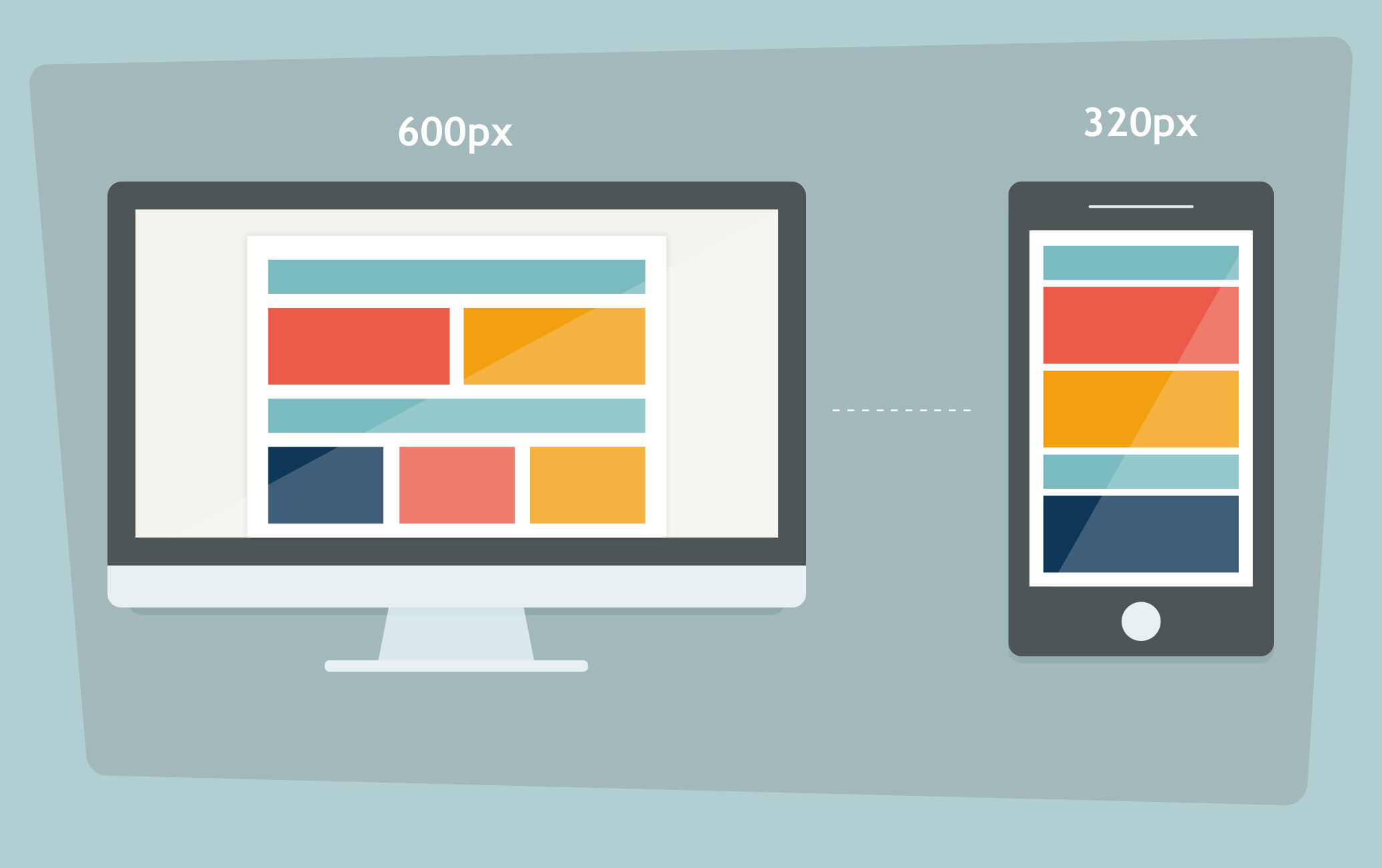
Image by Martin. (Mailbakery.com, 2016)