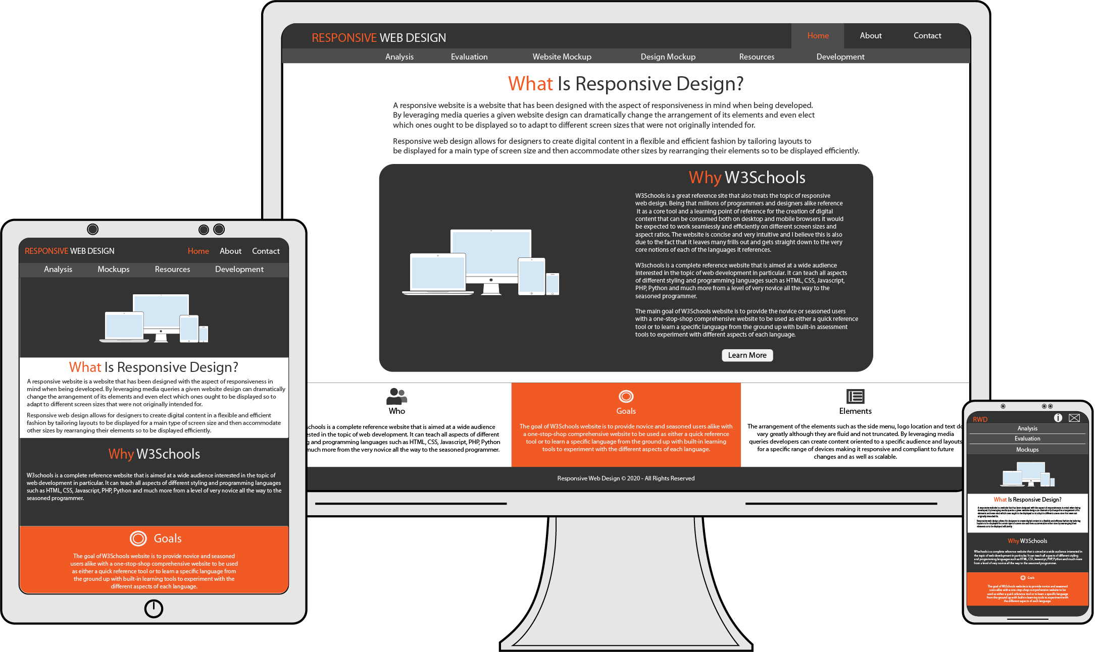
Creating Content:
Principles and Website Mockup
As we have talked about in our Analysis page, there are crucial differences when it comes to designing web-interfaces for desktops and mobile devices such as tablets and smartphones. Besides the screen real estate differences, there is also an essential detail that needs to be accounted for. That is the way we interact with content.
On a mobile device, it is almost imperative to rely on a touch-based interface, whereas on a desktop, user interaction occurs through pointing devices like mice, trackballs, and more. As a result, when designing content for mobile devices, it is good practice to consider the following principles to ensure optimal user experience.
Top 10 Mobile Design Principles
- Focus On Key User Goals.
This translates into designing content that takes the user to the accomplishment of their goals quickly and efficiently. - Do Not Just Port.
Instead of porting content from desktop to mobile, think and plan in advance for a design that is optimized for a mobile experience from the very start. - Cut Out The Clutter.
Screen real estate is to a minimum therefore stick with those key user goals and only those. No need to cram stuff. Less is more here! - The Smaller The Device, The Bigger The Content.
Keep UI components to a minimum of 44px by 30px. This will contribute to a more comfortable and efficient user experience with less frustration and more user error-proof.
- Break It Down.
Simulate user experience as you go along in the design process. Count all the steps a user needs to take to get from point A to point B. Fewer steps betoken a more efficient design. - More Tapping Less Typing.
User typing is a good pointer of the lack or inability to lessen the number of steps designers could save. Having a user rely solely on tapping and less to no typing can make a whole lot difference between one interface and another. Guess which one users fancy? It should be a no-brainer. (Turner, 2020)
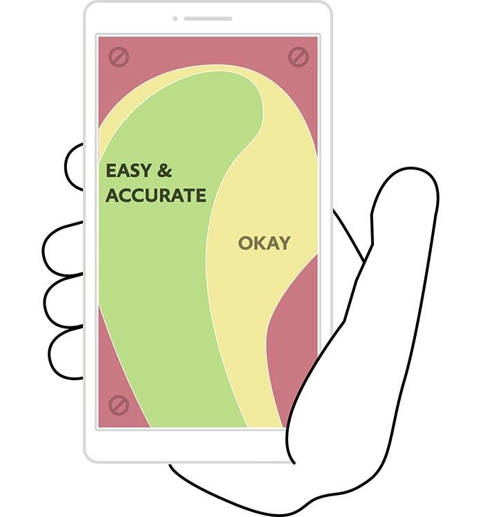
- If They Can Reach It One-Handed It Is Half The Battle.
Strategic positioning of elements and controls that are at reach with one-handed operations talks a lot about the user in mind when designing web apps. Check this image out for optimal, real-life user-experience of how we use mobile screens every day without even realizing the most used zones of a screen. - Leverage Mobile Capabilities.
Instead of having users entering a credit card number, let them use their built-in camera to grab that info. Looking for a store nearby? Use your GPS to find it instantly. Now we talk! - Test, Test, Then Test Some More.
You are a designer and a user too. That is good. That is bad also. When user testing, have other real users testing your app on a variety of mobile devices. Ask them what they would like to see improved. What is their struggle? Rely on interactive mobile prototyping tools such as Usertesting.com, UX recorder, and more. You'll be surprised! - Hands Off And More.
Creating a seamless experience is crucial. Allowing users to pick up where they left off is a big plus. When designing web content, do not think of mobile experience in isolation. Instead, think of it as a complementary measure to the desktop one. Think of it reciprocally. Can the user pass to a desktop without losing whatever they were working on and vice-versa?